${ product.name }
${ product.typeTitle }
Item no ${ product.sku }
- ${ setting }
- ${ product.variantName}
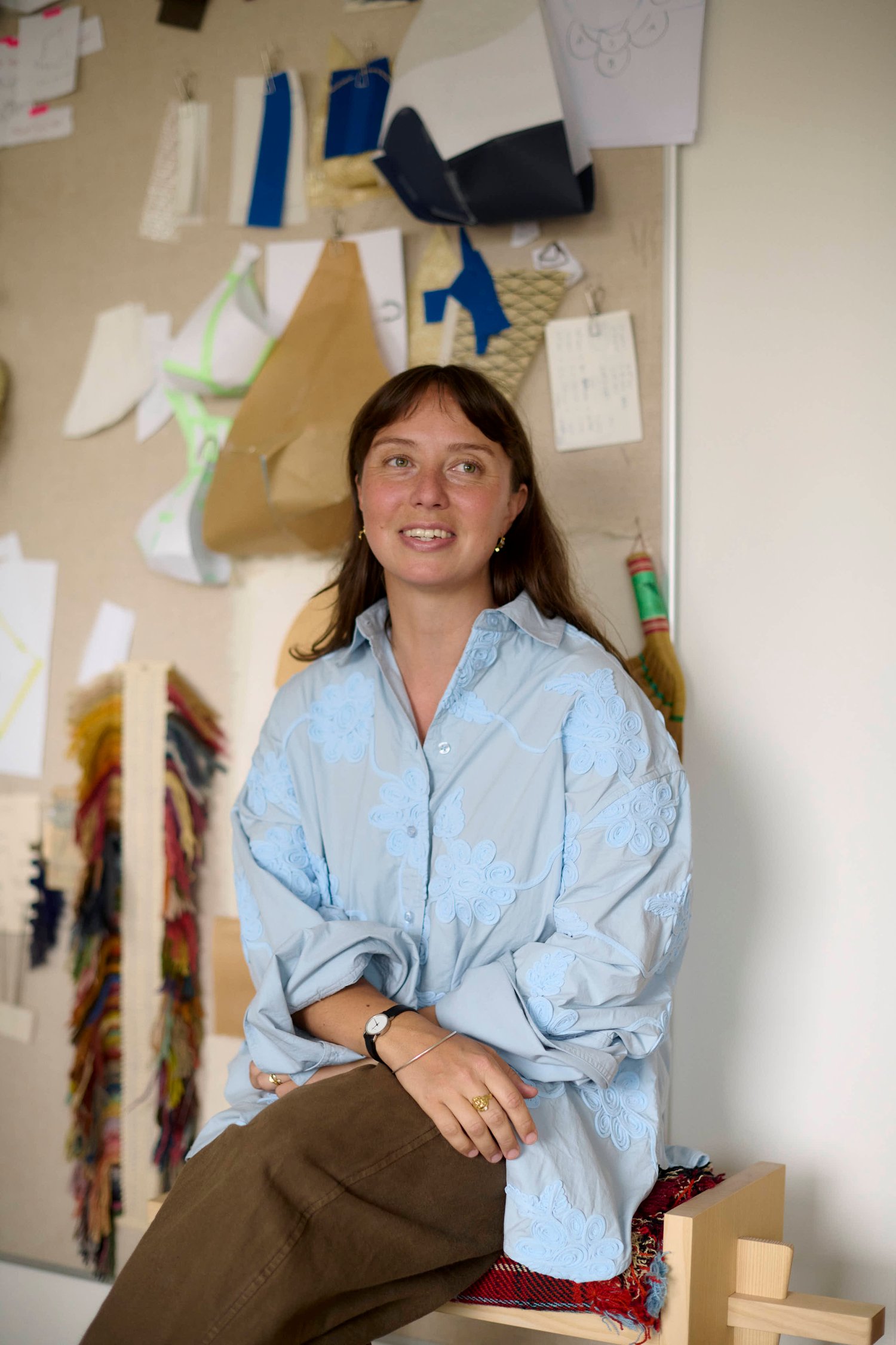
Studio visit
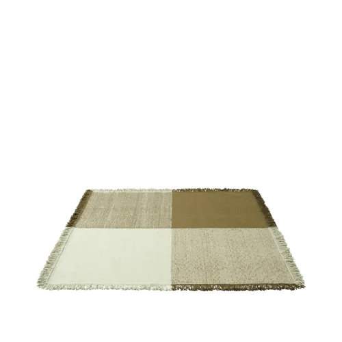
The winning design from Muuto Design Contest 001, Sia Hurtigkarl’s Verso Rug, began with a central theme in her practice: the inherent logic of textiles. Exploring subtle shifts in color and surface, she translated this thinking into a rug built from one of weaving’s most fundamental constructions. Now joining the Muuto collection, Verso Rug retains the original thinking that first set it apart.
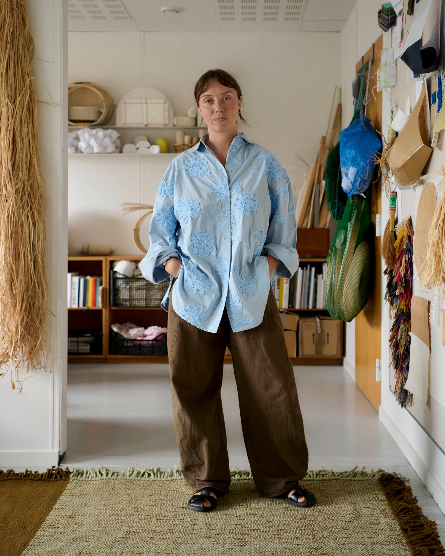
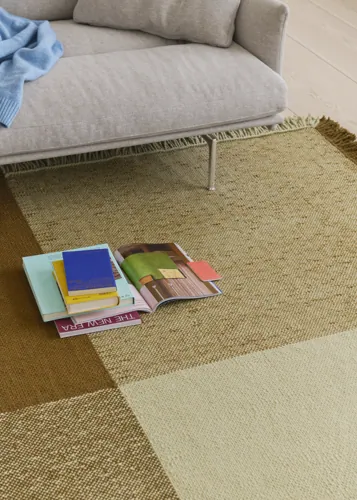
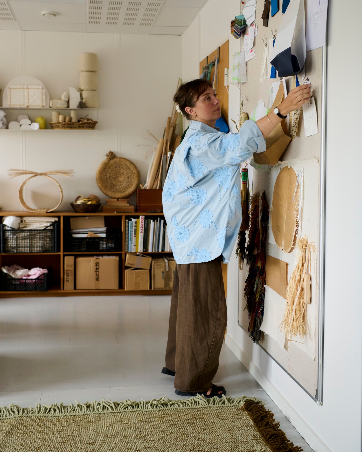
Woven in a balanced plain weave, Verso has no fixed front, back, or direction; two colors shift across its surface, and hand-twisted fringes trace all four edges. We visited Hurtigkarl in her Copenhagen studio to revisit the thinking behind Verso — and see how an idea rooted in landscape, craftsmanship and honest construction has taken on a new life. It’s quite satisfying how it hasn’t changed that much,” Hurtigkarl says.
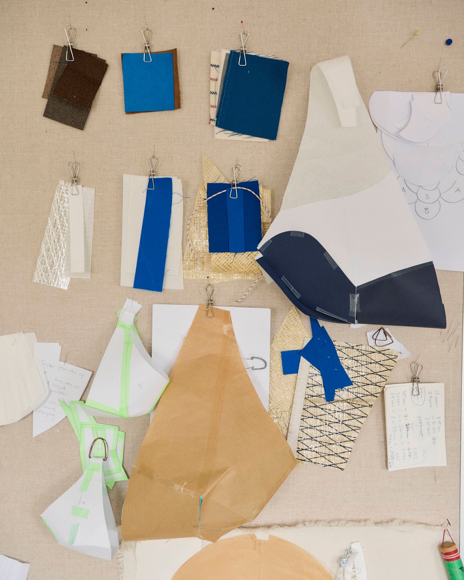
Textiles are the foundation of Hurtigkarl’s practice, and her designs often begin with an understanding of how a material is made. Verso grew out of ‘Landscape to Landscape’, a body of work inspired by the Danish coastlines around her. Photographs of shifting colors, surfaces, and horizons became a visual starting point, translated not as a pattern, but through the structure of the weave itself.
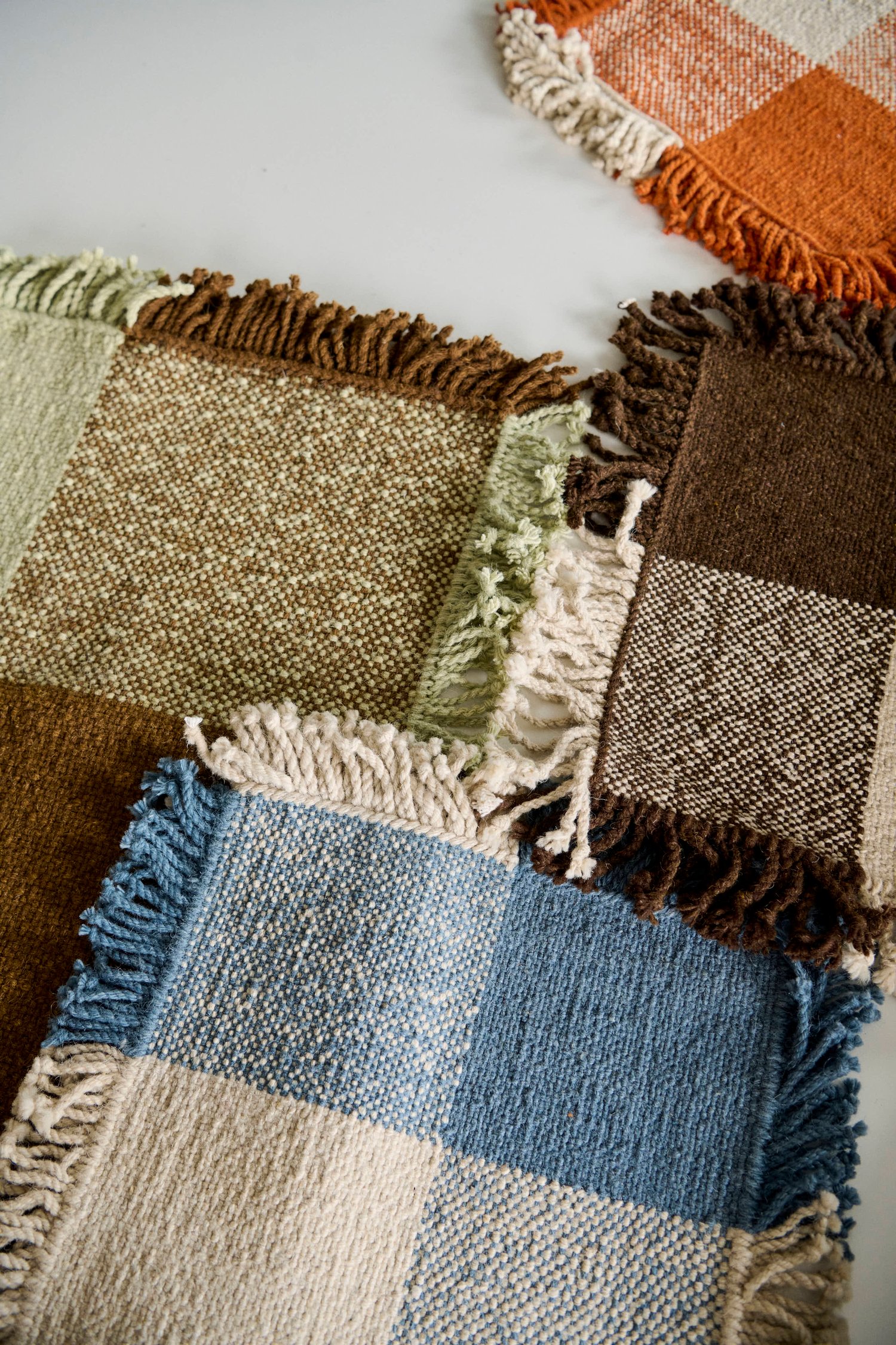
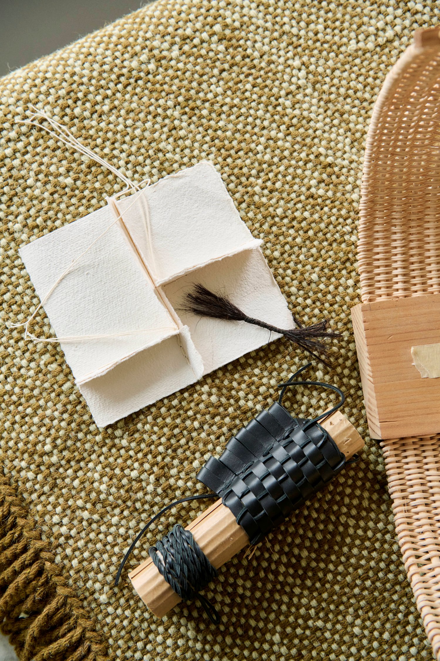
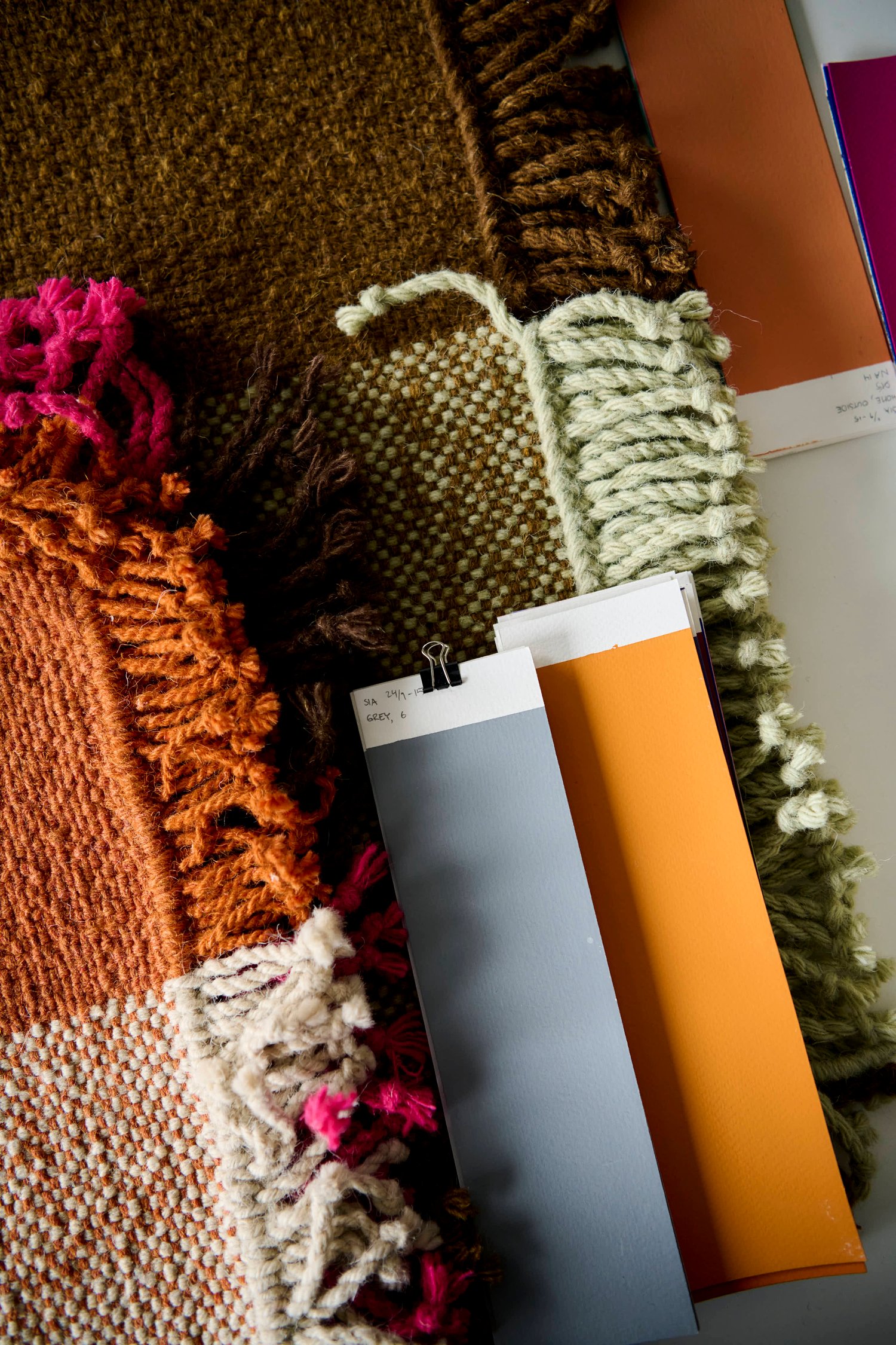
At its core is a simple plain weave, where warp and weft meet in equal balance. Two colors move between solid and mixed areas as the yarns cross, creating subtle shifts across the surface. “For someone who isn’t textile-oriented, it would be hard to tell which one is the weft and which one is the warp,” she says.
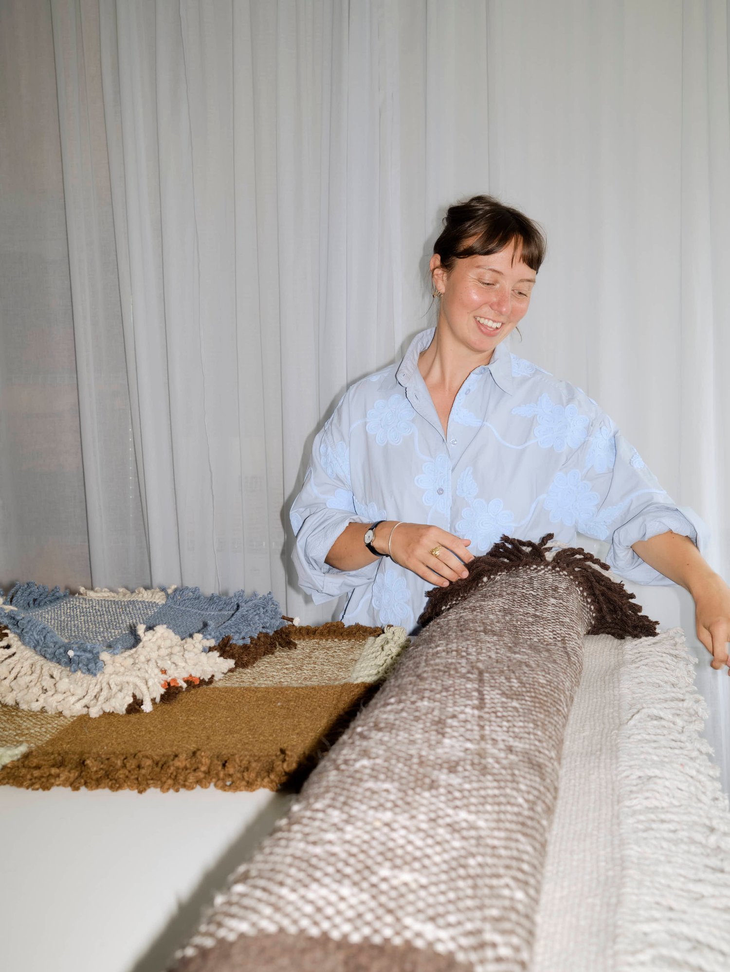
That balance also removes a rug's usual directionality. Fringes run along all four sides, rather than marking two distinct ends, while the same construction appears on either side. “Usually the fringes at each end of a rug really dictate that there is a back and forth, and a right way to put it,” Hurtigkarl says. “In this case, there’s not.” That openness is reflected in the name Verso. The rug can be reversed, rotated, and repositioned, allowing it to shift within a room over time. For Hurtigkarl, these qualities are not features added to the design, but consequences of its construction. “It will be exactly the same on each side,” she says.
It connects to a recurring idea in her work: readability. Hurtigkarl is interested in objects that reveal something about how they are made, allowing construction, material, and craftsmanship to become part of their expression. In Verso, that readability is everywhere. The weave forms both structure and expression, while the fringes allow the yarn to remain visible beyond the woven surface. There is an honesty to it – an invitation to follow the thread and understand how the object came to be.
“For me, the readability of a design is something that speaks to honesty and simplicity in the best possible way. I really appreciate that we can sort of read a design as an audience and as a user.”
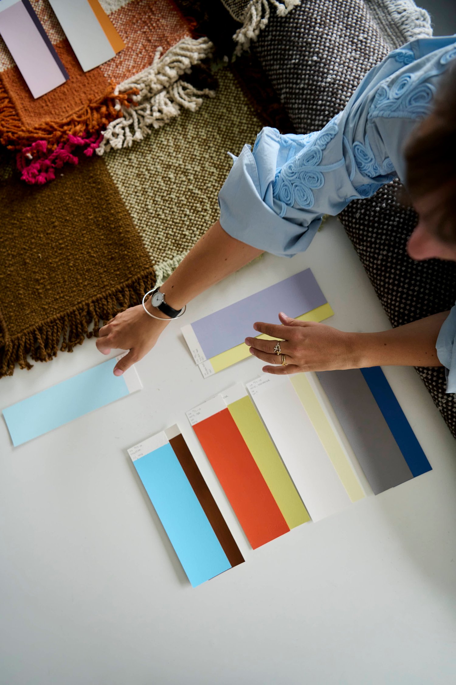
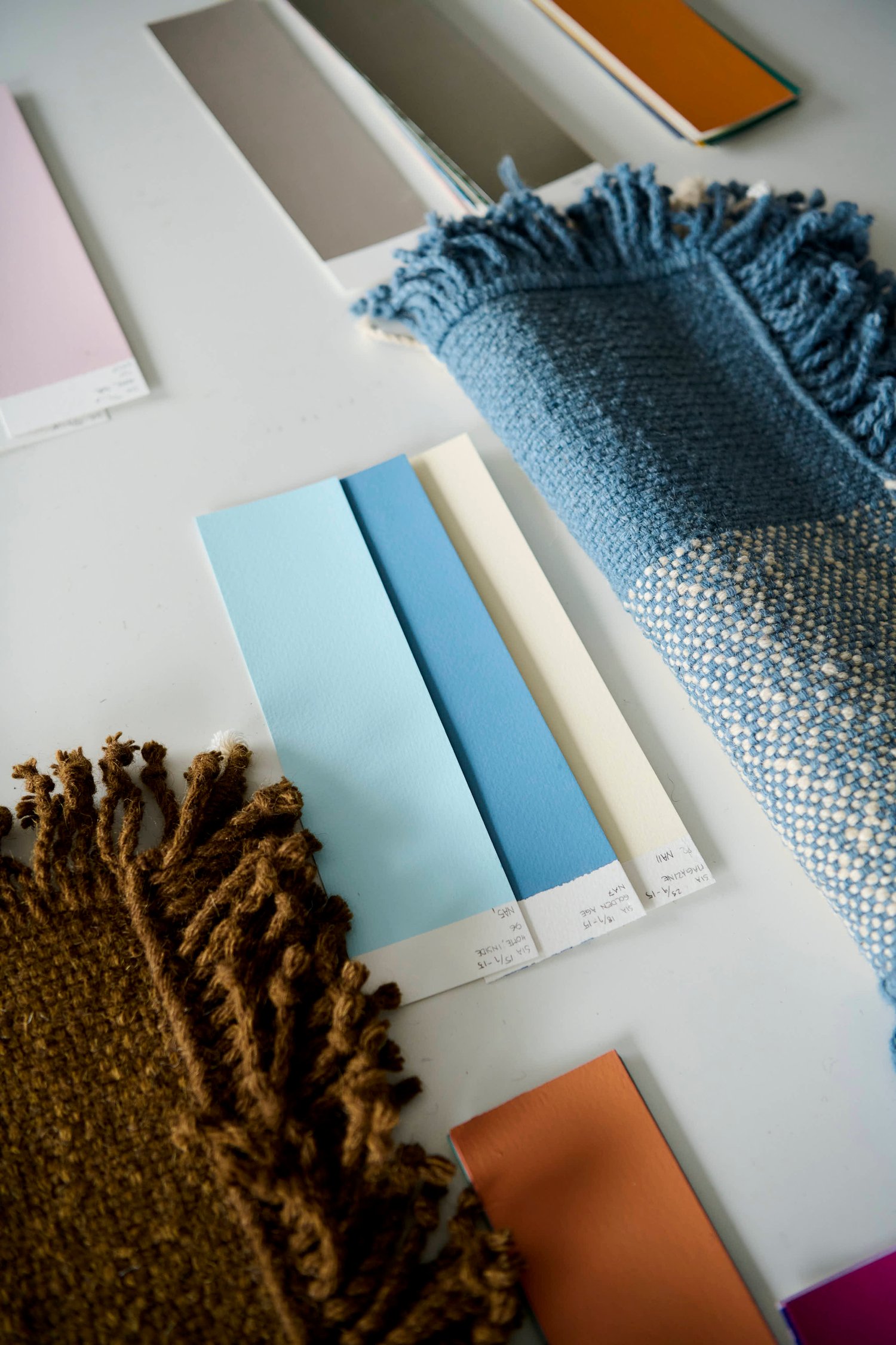
Color adds another layer without disrupting that visibility. Verso works with only two colors, allowing the weave itself to create variation as individual tones meet and mix across the surface. “I appreciate color, but I also think keeping it simple is key for me,” Hurtigkarl says. “It has this calm dialogue between two colors.”
For her, balance is one of the key words for the design. Warp and weft are equally weighted, neither side takes priority, and solid and mixed colors coexist within the same straightforward construction. Developing the palette with Muuto has allowed that system to take on a new expression, with Verso Rug available in two colorways: Cool Grey/Dark Brown and Pale Green/Warm Brown.
“It’s nice to have this color dialogue with Muuto now and see it in different colors,” she says.
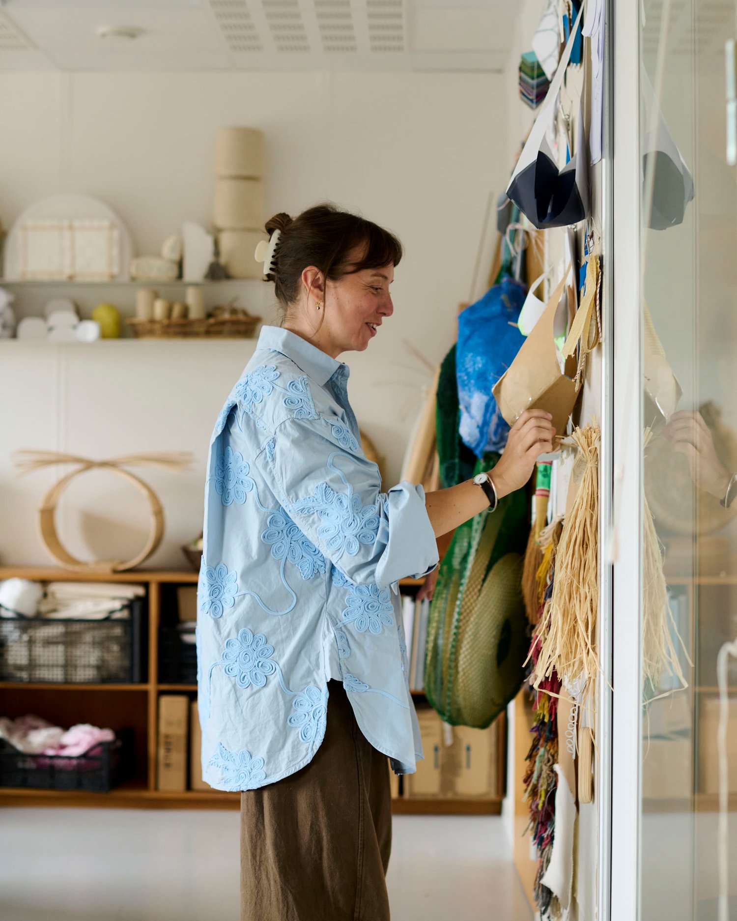
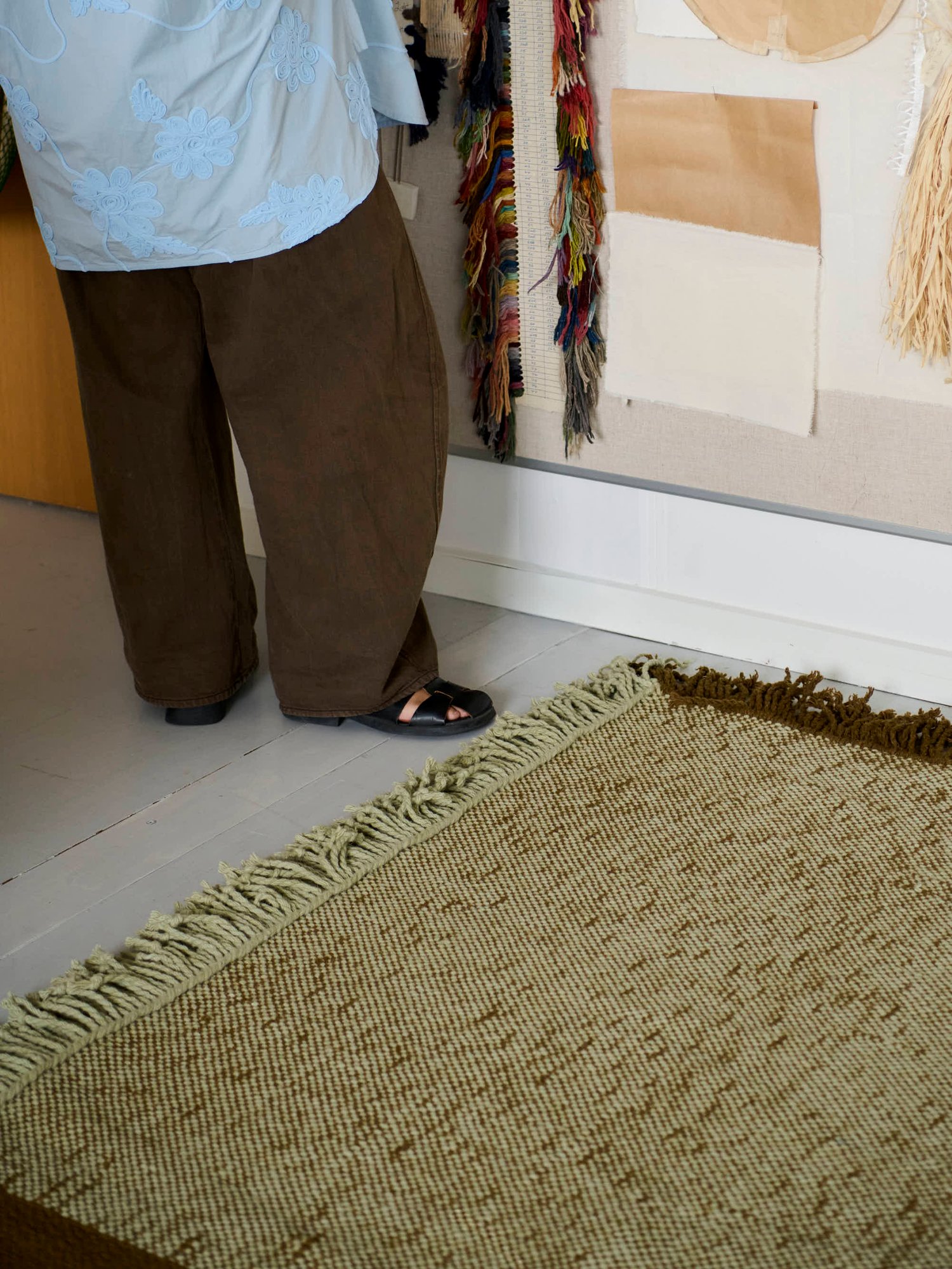
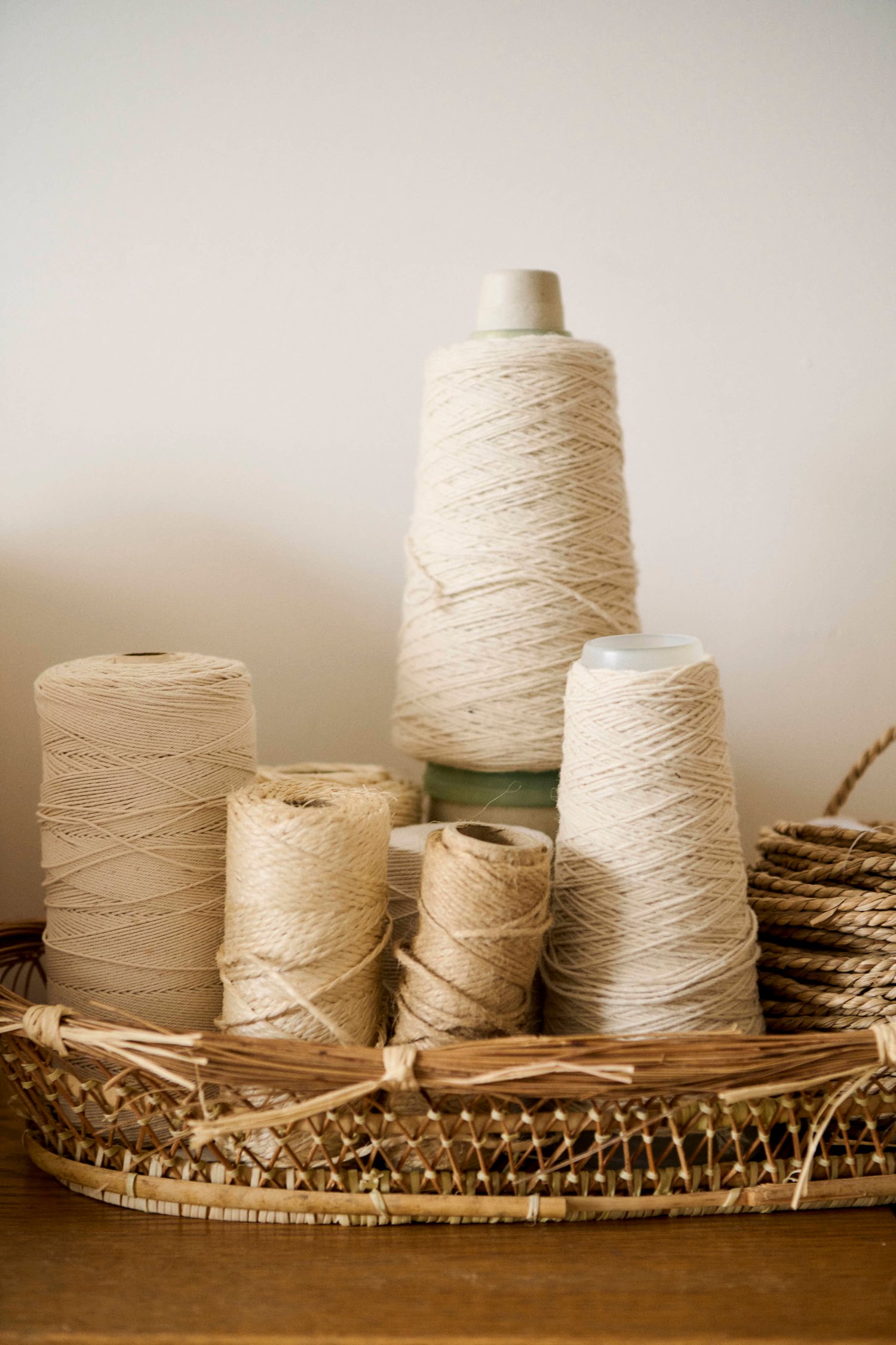
Verso is made entirely from wool, reflecting Hurtigkarl’s preference for tactile and pure material. Her knowledge of textiles means these choices are considered from the outset rather than applied later. “I guess that comes from having knowledge about your technique or your material,” she says. “From the beginning, you think of it as a design that can be produced with the techniques that are most obvious to use.”
Against the regularity of the plain weave, the finishing introduces a more tactile gesture. Each fringe along the four edges is twisted by hand, bringing a trace of craftsmanship to the rug’s otherwise ordered construction.
“The rug itself has a very repetitive weave, so it’s simple in a good way,” Hurtigkarl says. “Then finishing it off with this handmade element is really nice.” It is a small detail, but one that speaks to the qualities Hurtigkarl has pursued throughout the project: tactility, craftsmanship and care. The construction is not concealed, but becomes something to see, touch and understand.
There is also a particular joy for Hurtigkarl in imagining what happens once a piece leaves the studio and becomes part of someone’s home. She is drawn to objects that are used and lived with over time, interacting with the furniture around them rather than necessarily taking over or demanding attention.
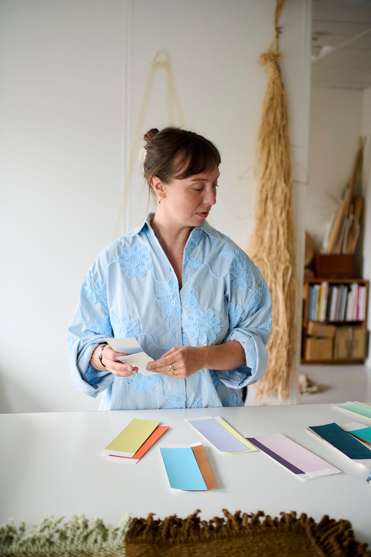
“For me, there’s something really rewarding about making pieces that become part of people’s everyday environments,” she says. “I like the idea that they can work naturally alongside the things that are already there and become part of everyday life.”
It is an idea that feels particularly fitting for Verso. With no prescribed front, back or direction, the rug can move and shift within a room over time, finding its place among the objects around it.
Verso has remained remarkably close to its starting point: one material, two colors, a balanced weave and four hand-finished edges. Its simplicity leaves room for movement and interpretation — a rug without a prescribed direction, designed to be lived with from either side. “I couldn’t hope for much more, I guess,” Hurtigkarl says. “It’s great to have a design that hasn’t changed much, but still have a new life or a new version.”
${contentData.items}